MACD secrets to help you make more money trading

MACD secrets to help you make more money trading

In this article I’m going to share with you some MACD secrets on how you can use the MACD indicator in a really practical way to make more money trading. You will not likely find these useful, very simple and practical tricks discussed anywhere! If you are intrigued please read on!

MACD Secrets… First, what is the MACD indicator?

The MACD indicator stands for Moving Average Convergence Divergence. We discussed in detail the technical side of how this indicator works in one of our other blog posts. You can read the technical detail here:

OK. So now you know what the MACD is, how can you use it in a practical way to make even more money when you are trading?

MACD tips which other traders don’t tell you…

The first MACD secrets we would like to share with you, is how to use the MACD to help you avoid taking losses when an uptrending market is starting to change direction and it’s running out of steam. We discussed how this can be done by noting the swings high or low of the MACD indicator, and whether or not the market is making higher highs based on these, in this article:

So how else can you use the MACD? What other MACD secrets are there to share? The MACD can show you the strength of momentum. Let’s take the histogram bars as an example… when the histogram bars are growing in size, it means the market is either increasing strongly or decreasing strongly in price. Also, when the histogram bars turn from dark green or dark red to light green or light red, it means the market’s price is losing it’s strength in which ever way it has been travelling… let’s take a look at some examples:

For a discount on the charting software used (Trading View), please click here:

https://www.tradingview.com/?aff_id=117138

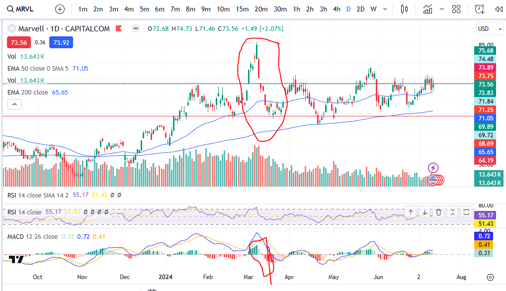
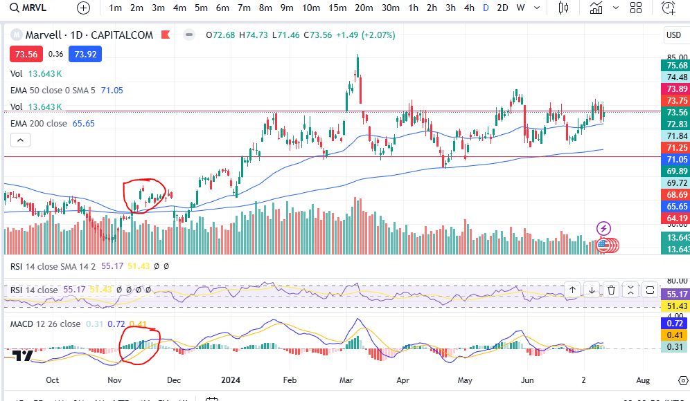
I’ve provided the example of Marvel above. As you can see, the MACD histogram bars are dark green usually straight after a cross over, which is why this indicator can be used to spot an entry signal after a cross over below the zero line of the histogram, but after the cross over, how do you know whether the market is losing it’s strength? Note the colour change of the histogram bars on the above chart and then compare that to the price action above:

I’ve circled an example – you can see when the histogram started turning light green, the market’s price started dropping like a brick. On this occasion the indicator was slightly ‘lagging’ but you can see other examples where there was an early warning before the market dropped! See the example below:

You can see the colour of the histogram bars were flicking on and off from dark to light green – a warning sign! Then what followed? The upwards move completely lost it’s strength and the market started making a pull back.

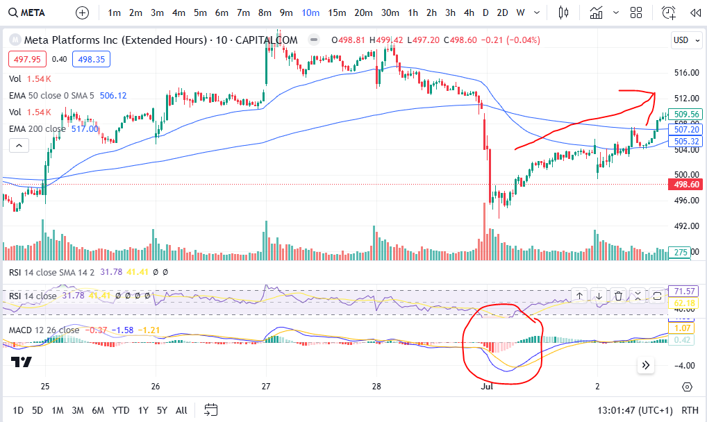
Another way you can use the MACD to tell you what the market is likely to do, is by looking at the shape of the MACD cross over. If the shape of the MACD and Signal lines going into the cross over are such that they are almost at a vertical angle, this can be a really good indication that the price is going to move quickly in the direction of your choice… if the cross over is happening with a gradual ‘sliding’ ‘converging’ of the two lines this can be less fruitful. Let’s take a look at some examples:

As you can see in this example on Meta Platforms, the blue MACD line scooped under in such a way that it had a lot of momentum and the price pushed significantly higher after this on the chart. Let’s look at the opposite situation:

MACD secrets

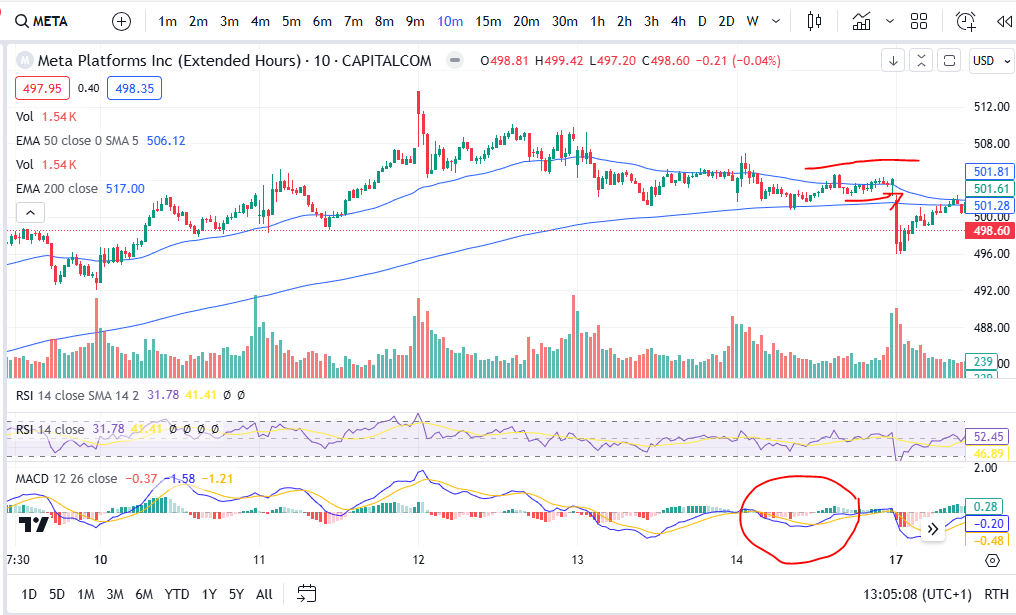
As you can see here, the price movements are almost flat after the cross over circled above- the MACD and Signal lines were very closed up after the cross and before the cross – and the price movement following the cross was insignificant. Indeed, the price actually took a nose dive shortly after this area on the chart! The momentum for the price to go up was weak and exhausted.

Once you get the hang of spotting these very practical MACD secrets, they really can help you in understanding the markets. We hope you found this article helpful.

For more great tips and advice on trading the stock market, please visit:

https://trader-pro.co.uk

To watch me trade live please visit my patreon page here:

https://www.patreon.com/Traderpro8320

Finally, if you would like to receive a discount on the Trading View charting software I use, please click on the relevant link here:

https://www.tradingview.com/?aff_id=117138

Please note any subscriptions taken via my affiliate link with Trading View may result in me earning a small commission.  However, I provide complete transparency on me using Trading View personally – I publish my success on the financial markets via my broker reports and any profits earned were done so by using my own Trading View subscription,  so I genuinely do recommend them and have been using the Trading View charts for many years.

Support and Resistance – how to make more money trading

Support and Resistance – how to make more money trading

In this article I’m going to explain what support and resistance is, how it affects the markets and how you can use it to make more money in your trading. All traders have got knowledge about support and resistance, and they use this knowledge frequently when placing trades on the market – it would be suicide to attempt trading without it! So let’s get started in understanding it!

What is support and resistance?

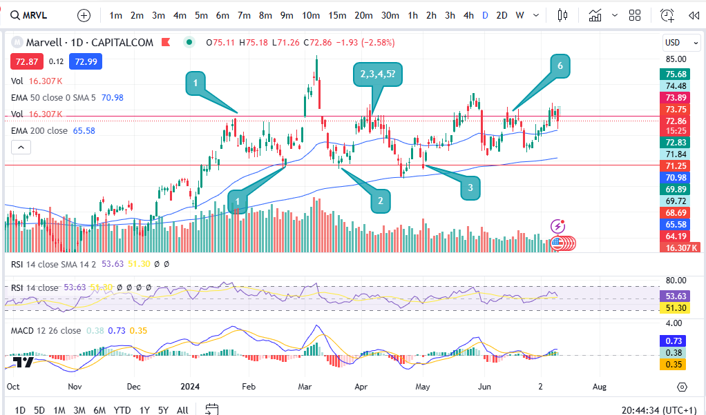
Support and resistance refers to areas which are particular zones of a financial chart where the price tends to touch the area and then rebound away from it. These areas are where there tends to be a lot of buying and selling pressure. Let’s take a look at some examples:

OK… So I’ve given you the example of the chart of Marvell. (If you would like a discount on the chart software I use, please click here):

https://www.tradingview.com/?aff_id=117138

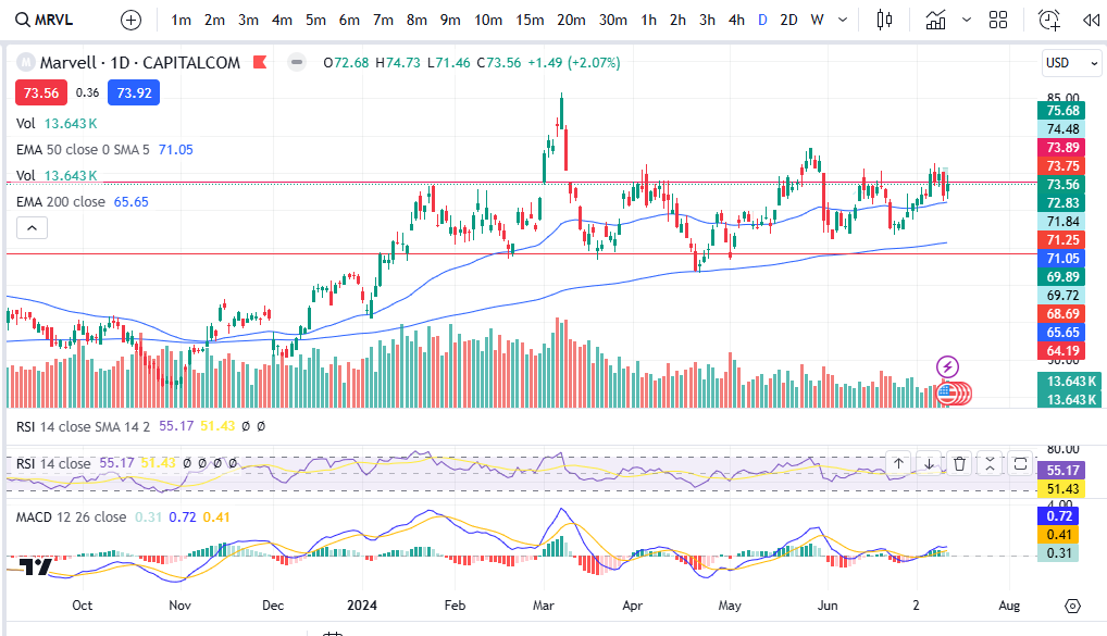
As you can see on the chart, the price tends to touch the red lines and then rebound away. It has done this several times (numbered with the chat bubbles). When the price gets to around 71.25, the price tends to react at this level and push up from there. The opposite is true for the red line at the top of the price movements which is around 73.69.

So why does the price move in this way?

The answer is that many sellers including hedge funds and institutional investors, are aware that the price historically has reached such a level as a limit to the extent to which it can stretch before rebounding. Sellers and buyers are aware of these historical levels – and they then reinforce them by buying and selling at these levels even more, which creates something similar to a self fulfilling prophecy.

For example, if historically on the chart it can be noted that the price always moves up after it falls to the 71.25 level, many buyers will be watching and waiting for the price to reach this level before they place a buy order. They know there is a strong probability that the price will increase from this area. This in turn leads to more buying pressure and volume, creating the movement again away from the area – and so a pattern is formed after some time where this happens repeatedly. This leads me on to discuss the ‘usefulness’ of support and resistance in trading.

So how can support and resistance be used in trading?

If you can see historically that the price tends to move upwards after it touches a particular point on the chart, you can make a note of this and wait patiently for the price to enter the ‘support’ zone. The area will be called a support if there is a lot of buying pressure there. Likewise, the area is referred to as a ‘resistance’ when there is a lot of selling pressure at the area. Once the price has entered the support zone, the buyer can place a buy order and wait for the price to ascend upwards in line with the historical movements. The movement upwards from a support is not guaranteed but it will have a strong probability to move upwards from that spot.

The same is true for placing a sell order at a resistance level. A seller can place an order there and wait for the price to descend towards a profit target.

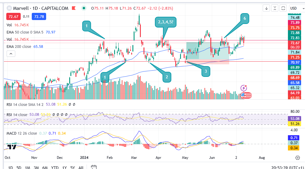
The stop losses can be set to the other side of the support/resistance zone, as so:

The stop loss would be placed where the bottom of the red zone is on the trade set up diagram above. The target could be set for the upper resistance area/line. This would apply the opposite way for a sell at the top line with the stop loss being placed above the top red line and the profit target being placed at the bottom red line.

As well as taking profit at these types of zones, some traders also place ‘break out’ trades. Break out trades work on the basis of the event of the price breaking through a strong support or resistance level. If this happens the price tends to move far and quickly beyond the level. Some break out traders achieve a 4:1 reward risk ratio for example. To understand risk management, please see my other article here:

How do you identify and draw these lines on the charts?

When ‘identifying’ support and resistance zones, you want to go to the daily time frame and zoom out as far as you can go, to see the greatest amount of historical price movement on the screen. Then take note of any really obvious levels. If you are squinting to see whether a level is present or not, it’s not! It needs to jump out at you and be really obvious. You want the price to have touched the level and rebounded at least three times but preferably more. The greater number of times it has touched the level and rebounded away, the better! I shared a video on my Patreon channel on how to draw support and resistance, here:

https://www.patreon.com/posts/support-and-102073984

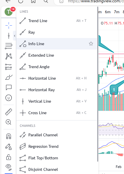
You can select some tools on most charts to apply horizontal or diagonal lines to a chart (support and resistance can happen diagonally too but these are less strong than the horizontal lines) – you can see them in Trading View in the menu on the left here:

support and resistance

Also note that the most recent activity is the most important activity. Be sure to observe any recently formed support and resistance lines as well as really old ones.

Another thing to be aware of is that when the price busts through one of these zones, let’s say a resistance level, this resistance will then likely become a support for the higher prices – meaning it will in future touch it and go up, whereas previously it was touching the level and rebounding down.

I hope you found this article helpful.

For more great tips and advice on trading the stock market, please visit:

https://trader-pro.co.uk

To watch me trade live please visit my patreon page here:

https://www.patreon.com/Traderpro8320

Finally, if you would like to receive a discount on the Trading View charting software I use, please click on the relevant link here:

https://www.tradingview.com/?aff_id=117138

Please note any subscriptions taken via my affiliate link with Trading View may result in me earning a small commission.  However, I provide complete transparency on me using Trading View personally – I publish my success on the financial markets via my broker reports and any profits earned were done so by using my own Trading View subscription,  so I genuinely do recommend them and have been using the Trading View charts for many years.
Amazing secrets to help you make more money trading – spot a downtrend early!

In this article I’m going to show you how to spot a downtrend early and identify whether or not a market is still genuinely uptrending. The first thing you look at is whether or not the price is floating above the 200 period EMA – sure, but how do you know if it’s started to downtrend, inspite of this? I share this secret below.

Spot a downtrend early – the highs and lows of the trend

The highs and lows of a trend really are the trader’s bread and butter. Without identifying these there are multiple things that can go wrong with the trading set up. New traders should really slow right down and take some time to identify these – they are critical to success. You will make a lot more money trading by spotting the highs and lows and avoiding bad entries where the market has just started to reverse to the downside.

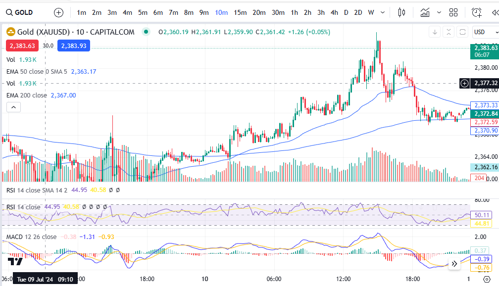
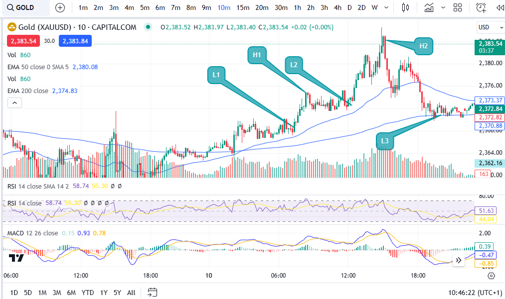
Let’s take a look at some examples. Let’s consider the market of Gold as an example, on the 10 minute timeframe… take a brief look at the chart below, and try to decide whether it’s uptrending based on recent activity, before continuing to read on…….. did you do it?

OK, let’s consider my answer to this question. It’s above the 200 period EMA – GREAT! However, let’s now look at the highs and lows. You can check exactly where the highs and lows are and use these to spot a downtrend early, on the basis of the ‘swings’ of the MACD indicator and this is one of the practical ways the MACD can really help you in your trading – aside from giving you entry signals:

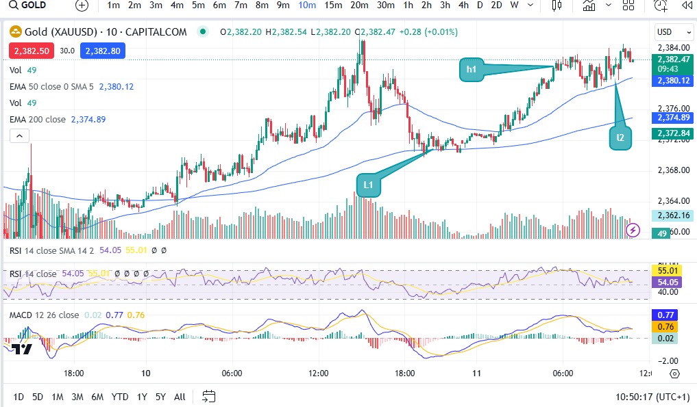
As you can see, at first glance the market does look like it’s now uptrending, but when you look closely, low 3 is now lower than low 2. In an uptrending market, the market makes ‘higher highs’ and ‘higher lows’. The pattern of uptrend has been anialated at the point of low 3. It starts again at that point – you can wait and see if it starts making higher highs and higher lows from that point onwards… a bit like this:

OK, so the pattern has started again at the original ‘low 3’ which I now refer to as low 1. As you can see it did go on to make higher lows again at low 2 in the above chart. You need the confirmation of it forming new highs and lows before placing a trade!

How this can help or hinder your strategy

Let’s consider what this could have done to your trade set up and win rate and profits/losses, if you ignored this break of pattern…

Let’s say you wanted to get in at the MACD cross over as your entry signal. (To understand more about this please see my strategy that I teach on Patreon, here:

https://www.patreon.com/collection/485557?view=expanded

You can also see my other article about how the MACD indicator works, and what it does, here:

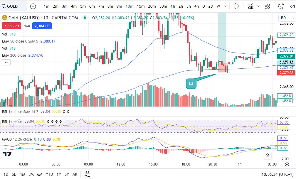
Let’s further suppose that you entered the market at the MACD cross over at the low which was previously referred to as low 3, here:

SPOT A DOWNTREND

You set your stop just below the low of the trend at the level which is shown in line with the bottom of the trade set up diagram applied (2370.33). As you can see, because the market was making lower highs, it went on to chop down into the stop loss before recovering. This loss would have been something that could have been completely avoided had the trader taken the time to spot a downtrend forming by identifying the highs and lows. Consistency in the pattern is key, before entering the market!

I have seen this help me avoid bad entries on many, many occasions. It does mean that you end up ‘avoiding’ placing trades and you place fewer trades, but with trading, less is more!! You will make more money trading, by placing fewer trades.

I hope you found this article helpful.

For more great tips and advice on trading the stock market, please visit:

https://trader-pro.co.uk

To watch me trade live please visit my patreon page here:

https://www.patreon.com/Traderpro8320

Finally, if you would like to receive a discount on the Trading View charting software I use, please click on the relevant link here:

https://www.tradingview.com/?aff_id=117138

Please note any subscriptions taken via my affiliate link with Trading View may result in me earning a small commission.  However, I provide complete transparency on me using Trading View personally – I publish my success on the financial markets via my broker reports and any profits earned were done so by using my own Trading View subscription,  so I genuinely do recommend them and have been using the Trading View charts for many years.
Japanese Candlesticks to make money – Tweezer Tops and Bottoms

Japanese Candlesticks to make money – Tweezer Tops and Bottoms

As well as providing a general and succinct set of data about the price at a given interval (see our Japanese Candlesticks Introduction page: Japanese Candlesticks – an introduction – Trader Pro (trader-pro.co.uk)), Japanese candles can also be used in conjunction with other indicators to identify good times to enter or exit trades. The first we consider are tweezer tops and bottoms. As the name suggests, Japanese candlesticks – tweezer patterns look a lot like pairs of tweezers either facing upwards or downwards. These are explained below with some examples on the chart together with what they are likely to mean/what they can predict is going to happen next.

Tweezer bottoms

Tweezer bottoms appear on the chart as identified in the screen shot below. They can appear at the end of a down trend and signify a possible change in direction. On a practical level, they represent a struggle between the bulls and bears where the price was pushed all the way down to form a long bottom wick (to a very specific limit) and then it recovered and the bulls took back control, pushing the price back up again. Another one with the same pattern (where the price was pushed to the same price level, and it then came back up), creates the ‘tweezer top’ shape. The bears were unable to push the price below the level seen in the tweezer bottoms. See the screen shot below. This happened twice in short succession before the price started trending in the upwards direction.

japanese candlesticks

Japanese candlesticks – Tweezer Tops

The same is true for candles which appear in the same way, but reversed. These are called tweezer tops. See the example below where the price reached the same high in two candles next to each other before the price was pushed back down in a new trend/direction. As a minimum you would need two candles but there could be more which test the same level either with tweezer tops or bottoms.

Japanese candlesticks

We hope this explains this very useful candlestick pattern. Now that you are familiar with this pattern you will start to notice it when you are waiting for a reversal and when taken with other indicators/criteria, it could be a good entry point (or exit) depending on the direction of the trade.

We hope this helped! For more great tips and trading set ups visit our other blog pages at Trader Pro – Trading strategies for success in the financial markets (trader-pro.co.uk)

If you would like to use the charting software above, we highly recommend Trading View to you. Use the following link and you may receive a discount on your subscription: https://www.tradingview.com/?aff_id=117138&source=TraderProBlog

Please note any subscriptions taken via my affiliate link with Trading View may result in me earning a small commission.  However, I provide complete transparency on me using Trading View personally – I publish my success on the financial markets via my broker reports and any profits earned were done so by using my own Trading View subscription,  so I genuinely do recommend them and have been using the Trading View charts for many years.
How to use MACD – The Moving Average Convergence Divergence to make more money

How to use MACD – The Moving Average Convergence Divergence to make more money

The MACD – Moving Average Convergence Divergence (hereafter referred to as ‘MACD’) is an extremely useful and very popular, indicator. It can help you to identify good entry and exit points and whether the market is over or undervalued as well as much more. There is a lot to this indicator. We discuss some of its more broad uses below.

MACD – The Moving Average Convergence Divergence – what exactly is it?

The MACD is a lagging indicator which is used for momentum and trend following trading strategies. It broadly displays two lines – the Signal line and the MACD line, which interact with each other by crossing over each other, intermittently. The indicator also displays a histogram which can be used to determine the strength of a given move in one direction or another, as well as an early indication of whether or not a buy or sell signal (MACD/Signal lines crossing (more below)), is about to happen. These components and uses are discussed in detail below.

MACD – The Moving Average Convergence Divergence – The ‘MACD’ line

The MACD line shows the interaction between two exponential moving averages. The settings for these averages can be tailored on the chart software. It is displayed by the software as the difference between the two moving averages, as set by the user. The default settings are a ’26 period EMA’ and a ’12 period EMA’ (EMA = “Exponential Moving Average”), and the default colour is blue (using Trading View software).

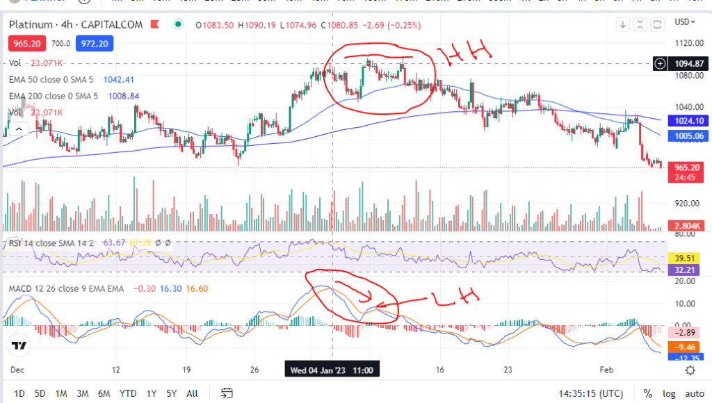
The MACD line can be used to identify whether a move is nearly at its end. For example, if the candles on the chart have reached a new high, but the MACD line did not, it can indicate that the move is running out of steam and a reversal may happen soon . This is referred to as ‘divergence’ – a divergence between the candles/price and the MACD line movements. Caution should be taken when attempting to use the indicator for entry points in this scenario. See the picture below. The candles reached a higher high (HH), but the MACD reached a lower high (LH). Following this, the price steeply declined . This was at the end of a long upward trend and it is within a trend that it is likely this cross over indicator would be used. Care should therefore be taken before entry, to check that there is no divergence in this way between price and the MACD line.

MACD – The Moving Average Convergence Divergence – The ‘Signal’ line

The signal line is a nine day EMA of the MACD line. The default colour of this line is orange.

When the signal line crosses the MACD line, it can indicate that the price is going to move higher or lower from an oversold or overbought level. See the example below. The signal line crossed the MACD line at a dip in the price and following this, the price trended higher. This is used by many traders, when taken with other confirmations, as a good entry signal. The writer uses this indicator the most, in trading set ups. The use of the indicator in this way is meant to identify good entry points on trends. Therefore, it should not be used as an entry signal when the price is consolidating between two very obvious levels.

The ”Histogram’

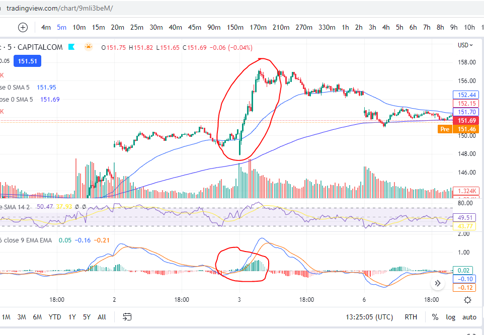
When the data in the histogram is above the baseline (positive), it means that the MACD is higher than it’s nine day average, meaning that the price has recently seen an increase or upwards momentum. The opposite is true for the opposite scenario – if the data is below the zero line on the histogram, it indicates that there has been some recent downward momentum. This can be seen on the chart below, where there was a strong upwards push and the histogram went from negative (red) to positive (green).

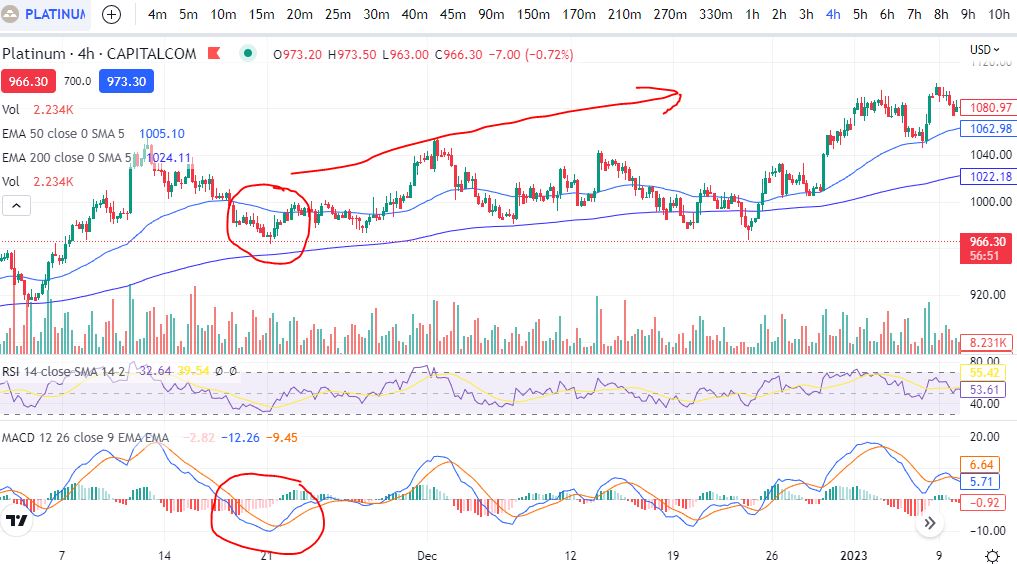
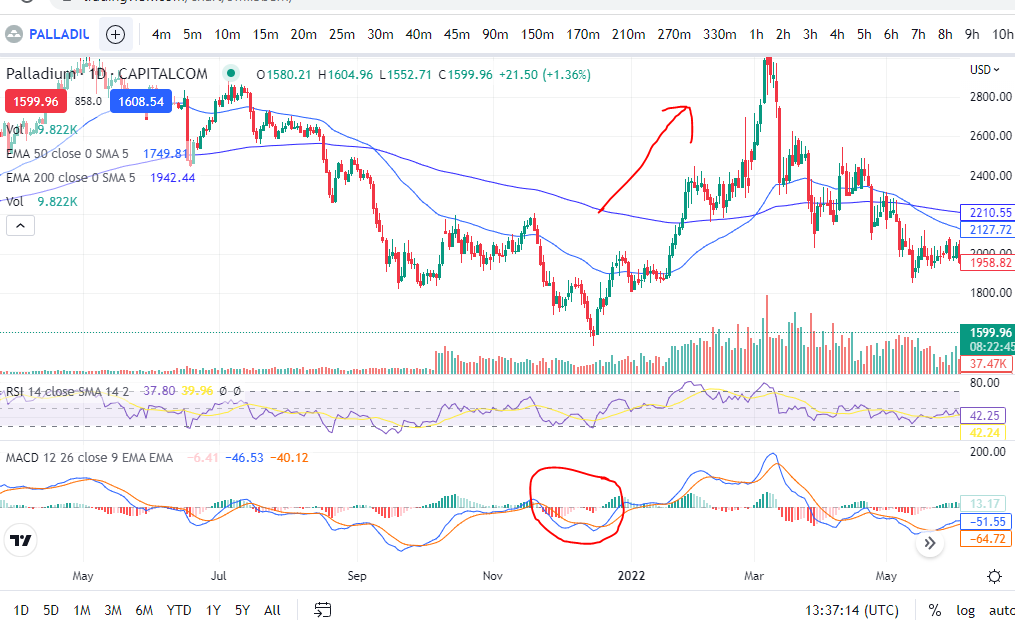
The histogram can be used to determine if a cross over is anticipated when it forms divergences. These divergences can be seen with reference to the peaks and troughs in the histogram and the MACD line. For example, if the MACD line creates a lower low, and the Histogram data displays a higher low. This is displayed, by way of example, on the chart below. You can see that the histogram made a higher low (see movements in red circle), but the blue MACD line, had reached a lower low. Following this, the MACD and Signal line crossed over and the price moved significantly higher. You can watch for the opposite scenario if you are waiting to short the market – a higher high on the MACD line, but a lower high on the histogram. This can indicate the MACD and signal lines are about to cross for a downward move. The histogram pattern can be in the form of peaks and troughs for the higher lows etc, or a slanted pattern where there is no dip in the histogram – it is just more smooth looking!

MACD

Identifying overbought and oversold levels

As you can see in the chart picture above, the MACD indicator tends to broadly follow the shape of the RSI indicator (‘Relative Strength Index’). If you are not familiar with the RSI indicator, broadly, the price is overbought when it reaches the top part of the indicator (roughly anything over the value of ’70’ would be overbought). The opposite is true when it reaches the bottom part (say, below 30). Unlike the RSI indicator, the MACD is not adjusted for each market so that it displays ‘comparative information’. What is meant by this, is that on Palladium above, the value at overbought levels, on the RSI indicator, will always be roughly ‘over 70’. The same will be true for any other market displayed on the chart when using the RSI. However, the MACD indicator does not provide equivalent values/it does not keep the ‘overbought’ value the same between different markets. Instead, you can use the ‘shape’ of the MACD and signal lines to understand when the price is either overbought or oversold for the market you are viewing in particular, with reference to the highest peaks and troughs of the MACD and signal lines.

For more secrets on using the MACD indicator, please see our other blog articles here:

and here:

https://trader-pro.co.uk/category/technical-indicators/macd-technical-indicators

We hope this information on how you can use the MACD indicator in your trading strategies and setups, has been useful. Keep an eye out for our blogs which we will use to display trade set ups including the use of this indicator.

We hope this helped! For more great tips and trading set ups visit our other blog pages at Trader Pro – Trading strategies for success in the financial markets (trader-pro.co.uk)

If you would like to use the charting software above, we highly recommend Trading View to you. Use the following link and you may receive a discount on your subscription: https://www.tradingview.com/?aff_id=117138&source=TraderProBlog

Please note any subscriptions taken via my affiliate link with Trading View may result in me earning a small commission.  However, I provide complete transparency on me using Trading View personally – I publish my success on the financial markets via my broker reports and any profits earned were done so by using my own Trading View subscription,  so I genuinely do recommend them and have been using the Trading View charts for many years.


The Simple and Exponential Moving Average – How to make money

The Simple and Exponential Moving Average – How to make money

The moving average indicator is used by professional and beginner traders the world over. They are an extremely useful weapon to have in your arsenal. Moving averages can give you a clear indication of whether the market is trending up, down or sideways and they can also be used as entry and exit points. We discuss the different types of moving averages and their uses below.

Moving averages – what are they?

Moving averages are what they sound to be – a line on your chart depicting the average of the price movement over a specified time interval.

There are many different types of moving average indicators, but two of the most popular ones include the Simple Moving Average and the Exponential Moving Average.

The Simple Moving Average (“SMA”)

The Simple Moving Average gives equal weight to each of the points in the time interval. It is a lagging indicator seeing as it follows the movement of the price.

The Exponential Moving Average (“EMA”)

The Exponential Moving Average places greater weight on the most recent points in the moving average line. It is a lagging indicator seeing as it follows the movement of the price.

How can moving averages be used to make more money in trading?

Moving averages can be used as great indicators to find entry or exit points.

Moving Average lower time frame entry points

For example, when entering a trade on a larger time frame, you may wish to zoom in, on a smaller time frame, and consider waiting for the price to jump up over the 50 period exponential moving average. This can indicate that the price has started to trend up. Conversely, if you are entering a trade on a larger time frame chart you may wish to see what the price is doing in relation to the moving average, on a smaller time frame – if the price is still below the moving average, it might be a sign to wait a while.

Moving Average indicators – Golden Cross / Death Cross

The moving averages themselves can be used as indicators in conjunction with other moving averages. For example, a common setting is to have two moving averages, one with a period of 50 and the other with a period of 200. If the price has been down trending for a while, at the point where the 50 period moving average crosses up over the 200 period average, this can indicate a good entry point. This is known as the Golden Cross.

Similarly, for the opposite situation, when the 50 period moving average crosses below the 200 period moving average, this is known as the Death Cross.

The Golden / Death Cross can indicate the start of a long down or up trend. They can be good indicators to use when riding a trend and trying to understand when the trend is going to come to an end. Lets take a look at some examples:

Golden Cross Moving Average entry signal
Golden Cross entry signal

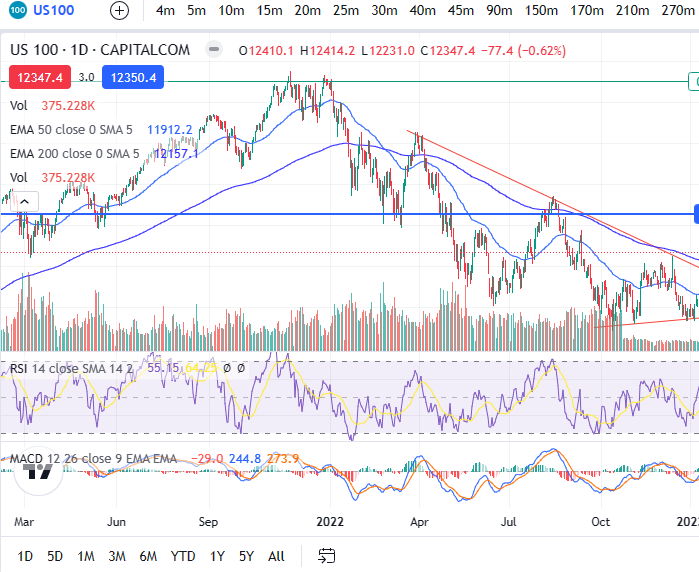
This is a recent picture of the 4 hour timeframe on the Nasdaq – the prices have begun to recover from the war in Ukraine – it remains to be seen whether they will continue to trend upwards – they could make another downturn and newer lows yet – however, this will much depend on the FEDS and any further interest rate hikes.

However, what can be seen here is that the 50 period EMA has now crossed up over the 50 period EMA. If the prices remain on the road to recovery/a bull market, the EMAs would be unlikely to cross back the other way, for a very long time. Similarly, in the chart below, you can see the start of the downtrend when the war in Ukraine began… This was in 2022 – you can see the 50 period EMA remained below the 200 period EMA for the whole time since then.

Death Cross - War in Ukraine - Moving Average indicator
Death Cross – war in Ukraine

Using the Moving Average for general trend direction

In addition to the above entry or exit signals, the moving averages can be used to understand very clearly, what direction the market is moving in. If the prices are above the SMA or EMA, the market is up trending. If they are below the SMA or EMA, the market is down trending. If they are crisscrossing up and down over the moving average, caution should be taken when using a trend following indicator or strategy because the price is likely consolidating between two points.

So we hope you enjoyed this information and that it helps you understand direction and some good entry or exit points for your trading. Happy trading!

We hope this helped! For more great tips and trading set ups visit our other blog pages at Trader Pro – Trading strategies for success in the financial markets (trader-pro.co.uk)

If you would like to use the charting software above, we highly recommend Trading View to you. Use the following link and you may receive a discount on your subscription: https://www.tradingview.com/?aff_id=117138&source=TraderProBlog

Please note any subscriptions taken via my affiliate link with Trading View may result in me earning a small commission.  However, I provide complete transparency on me using Trading View personally – I publish my success on the financial markets via my broker reports and any profits earned were done so by using my own Trading View subscription,  so I genuinely do recommend them and have been using the Trading View charts for many years.
The Volume Indicator – how to make money

The Volume Indicator – how to make money

In this blog we discuss the volume indicator. This is an essential indicator for most successful traders. It will give you an insight into genuine market moves, where the big money is, and help you avoid false entry signals. We hope this will be helpful to you on your trading journey!

What is the Volume indicator?

The volume indicator is an indicator which can show you the quantity of trades placed in a market over a given time interval (the volume of trades placed). In relation to futures or options, the indicator will display the number of contracts which have been bought or sold over the interval.

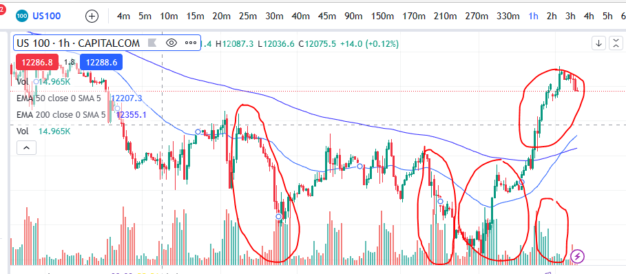
We provide below, a picture of the volume indicator on the NASDAQ. You can see that with the strong moves up or down in price, the volume is closely connected – it is in fact the volume which causes the price to rise or fall. Note what is happening to the price in the picture below, within the red highlighted areas.

Volume indicator

How can the volume indicator help you in trading?

Sometimes the market makers can cause a price to move without any genuine money behind the move. This can lead to traders entering into trades which look ok on the face of it, but which then don’t end up going anywhere or the price falls back down to where it was. If you see a price move higher but there is no volume, be ware. This may end up being a losing trade. The same is true for shorting the market – be ware of any price movements which are not supported or substantiated by a move in volume.

The volume indicator can also signal to you when the market move is becoming weak or exhausted. If you can see a sharp rise in volume together with a sharp increase in price, this can sometimes represent traders who got in as the market was becoming exhausted and it can mean the number of buyers is now depleted.

Volume can also be used to confirm whether or not the price is consolidating. If the price is ticking along without much volume between a price ‘range’ it maybe that the price is building up some momentum, like a stretched rubber band, and at some point soon, it will break out of the channel and make new highs or lows. You can use the volume indicator to help you avoid ‘false’ breakouts. If the price has broken out without supporting volume, it is likely that the breakout is a false one.

Volume indicators to choose from

There are a number of volume indicators to choose from. This article simply refers to the ‘Volume’ indicator – it can be found on the Trading View charts by searching ‘Volume’.

We hope this article will help you avoid some false break outs and identify some big moves in your favour. Happy trading!

We hope this helped! For more great tips and trading set ups visit our other blog pages at Trader Pro – Trading strategies for success in the financial markets (trader-pro.co.uk)

If you would like to use the charting software above, we highly recommend Trading View to you. Use the following link and you may receive a discount on your subscription: https://www.tradingview.com/?aff_id=117138&source=TraderProBlog

Please note any subscriptions taken via my affiliate link with Trading View may result in me earning a small commission.  However, I provide complete transparency on me using Trading View personally – I publish my success on the financial markets via my broker reports and any profits earned were done so by using my own Trading View subscription,  so I genuinely do recommend them and have been using the Trading View charts for many years

How to use Japanese Candlestick Patterns – Shooting Star and Hammer / Hanged man to make money

Another very useful candlestick pattern which any professional trader will be aware of, is the shooting star & hammer/hanging man. These are patterns which form from a single candlestick and can indicate that a reversal or new trend is about to start. We discuss these Japanese candlestick patterns below with some chart examples.

Japanese Candlestick Patterns – Shooting Star

Note that some knowledge of Japanese candlesticks is assumed on this page. Please see Japanese Candlesticks: An Introduction here, if you are new to Japanese Candlesticks: Japanese Candlesticks – an introduction – Trader Pro (trader-pro.co.uk)

The shooting star is formed by a single candle with a long upper wick and a very short or non existent lower wick. A picture of this type of candle is below.

Candlestick pattern - Shooting Star
Candlestick pattern – Shooting Star

The pattern is formed when there has been one last push/attempt by the bears to raise prices higher, but they failed and the closing price closed below, or very close, to the opening price.

Now let’s look at some examples on the charts:

Shooting Star & Hammer/Hanging man

You can see on this NASDAQ chart that the price was in a nice uptrend, until the shooting star appeared. Prices quickly descended from that point onwards.

How can you use the Japanese Candlestick pattern – Shooting Star in technical analysis?

If you are in a long position, waiting for prices to move higher and the shooting star candlestick pattern appears on the chart, it may, when taken with other indicators, indicate a good time to take profit off the table.

Japanese Candlestick Pattern – Hammer/Hanged Man

The Hammer/Hanged Man is the opposite of the shooting star. A picture of this type of candlestick pattern is below.

Japanese Candlestick Pattern - Hammer / Hanged Man
Japanese Candlestick Pattern – Hammer/Hanged Man

As in the case of the Shooting Star, the Hammer/Hanged Man candlestick pattern is formed when the sellers tried to push the price lower, but failed, and it closed very close to where it started. It can indicate a reversal of a downtrend/beginning of an uptrend.

Now lets take a look at some examples on the charts:

Shooting Star & Hammer/Hanging man
Hammer/Hanged Man candlestick pattern

You can see in the NASDAQ chart above that the price reached a low point and then the hammer/hanged man formed. The bulls took control – the candle is green in this instance so price was pushed all the way down the lower wick but came all the way back up again and closed higher than the candle’s opening spot. Following this, the price reversed in a strong uptrend pattern.

How can you use the Hammer/Hanged man in technical analysis?

If you are looking for an entry point or are waiting for a reversal, this candlestick pattern, when taken with other indicators, could give you a good entry point.

We hope this was useful. You are likely to see a great deal of these candlestick patterns on the charts – we hope you are able to make good use of them in becoming more profitable.

We hope this helped! For more great tips and trading set ups visit our other blog pages at Trader Pro – Trading strategies for success in the financial markets (trader-pro.co.uk)

If you would like to use the charting software above, we highly recommend Trading View to you. Use the following link and you may receive a discount on your subscription: https://www.tradingview.com/?aff_id=117138&source=TraderProBlog


Please note any subscriptions taken via my
affiliate link with Trading View may result in me earning a small commission.  However, I provide complete transparency on me using Trading View personally – I publish my success on the financial markets via my broker reports and any profits earned were done so by using my own Trading View subscription,  so I genuinely do recommend them and have been using the Trading View charts for many years.


Make more money with Japanese Candlesticks – an Introduction

Japanese candlesticks can be used to create trading strategies themselves or to just help you understand the direction and activity on the chart. We examine below, the structure of a candle stick and what it means, the different types of candle sticks you might see on a stock trading chart, and how you can use the candlesticks as indicators of market sentiment.

Japanese Candlesticks and timeframes

A new candle is formed on the chart every ‘n’ minutes/hours/days/etc, depending on what chart timeframe the chart is set to. For example, in the chart below, the timeframe setting is ‘D’ for ‘one day’ – so each day another candle completes its formation. As you can see below, there are many timeframe settings. Switching between them will change the candles so that a candle appears at each interval selected.

japanese candlesticks

Structure of Japanese Candle Sticks

An example of a Japanese candlestick is shown above.

The most obvious thing to say about these is that they look like candles – but each part tells you something about what is happening to the price, as follows:

  • – Upper wick – this element shows you the highest price level which the instrument reached within the timeframe applicable to the candles.
  • – Lower wick – conversely, the lower wick shows you the lowest price reached within the time interval.
  • – Candle body – the top part of the candle will show you either the closing price, or the opening price, depending on whether the candle is red, or green (sometimes substituted for blue). Broadly, if your trade is predicting the price to rise, green or blue candles are good news, red ones are bad, and vice versa. You can see on the chart above that when the price is rising, the candles are mostly green.

The purpose of using candle sticks is to provide a quick and visual indication of what is happening to the price.

There are a few special types of candles which are easy to spot and which have extra meaning. These are discussed on our Japanese Candlestick Patterns pages linked below:

Shooting star/Hanged man:

Tweezer tops and bottoms:

We hope this helped! For more great tips and trading set ups visit our other blog pages at Trader Pro – Trading strategies for success in the financial markets (trader-pro.co.uk)

If you would like to use the charting software above, we highly recommend Trading View to you. Use the following link and you may receive a discount on your subscription: https://www.tradingview.com/?aff_id=117138&source=TraderProBlog

To watch me trade live, please visit my Patreon page here:

https://www.patreon.com/Traderpro8320

Please note any subscriptions taken via my affiliate link with Trading View may result in me earning a small commission.  However, I provide complete transparency on me using Trading View personally – I publish my success on the financial markets via my broker reports and any profits earned were done so by using my own Trading View subscription,  so I genuinely do recommend them and have been using the Trading View charts for many years.