The Relative Strength Index (RSI Indicator) – how to make money

In this blog article I will share with you a detailed description of what the RSI indicator is, how it works and how you can use it to assist you in achieving success in the financial markets.

What is the RSI Indicator?

The RSI indicator is a type of momentum indicator. It measures speed and the size of a market’s recent fluctuations in price. It can be used to evaluate under or oversold buying/selling opportunities. The indicator is an oscillator and has a scale of zero to 100.

How is the RSI indicator used?

As well as showing the user when a market is overbought or oversold, it can also tell the user whether a market is likely to have trend reversal or pull back. It can be used as a buy or sell signal. Typically if the readings on the RSI indicator are abovev70, this would indicate that the market is ‘overbought’ and it is not at that moment, presenting a ‘good deal’. If the readings are below 30, this indicates that the market is oversold (a bargain). When the readings are above 70, this might be a good time to exit a trade in a buy position, or wait until the price drops before entering one. When the RSI is below 30, this could be a good time for getting into a trade.

The RSI can also indicate whether the market is either uptrending or downtrending. The indicator may remain in the overbought teritory for a long time while the market is in an uptrend, and the opposite is true for downtrends.

The RSI indicator can be used to spot reversals. If the RSI is unable to reach 70 on a number of consecutive attempts during an uptrend, and then drops below 30, this could indicate that the trend is losing its strength and the price may reverse to lower levels.

How does the RSI indicator work?

The RSI indicator compares a market’s strength on intervals when prices go up to the market’s strength on intervals when the prices go down. The result of this comparison is an indication of how the market may perform in the future.

The RSI is calculated as follows:

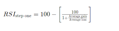
The standard number of intervals used to calculate the RSI is 14.

Drawbacks

Despite being extremely useful, the RSI can give misleading signals when markets are either in a strong uptrend or downtrend. For example, if the market is uptrending, the RSI may not fall to near the 30 area at all… To combat this, the trader could ‘adjust’ his/her view in this scenario to note where the RSI falls to (which level) when it is at a low on the trend in an uptrend and vice versa.

The indicator works best in long term trends. It is however, most useful in an oscilatting market.

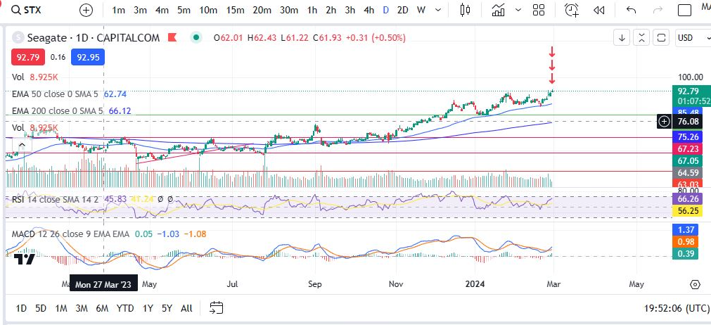
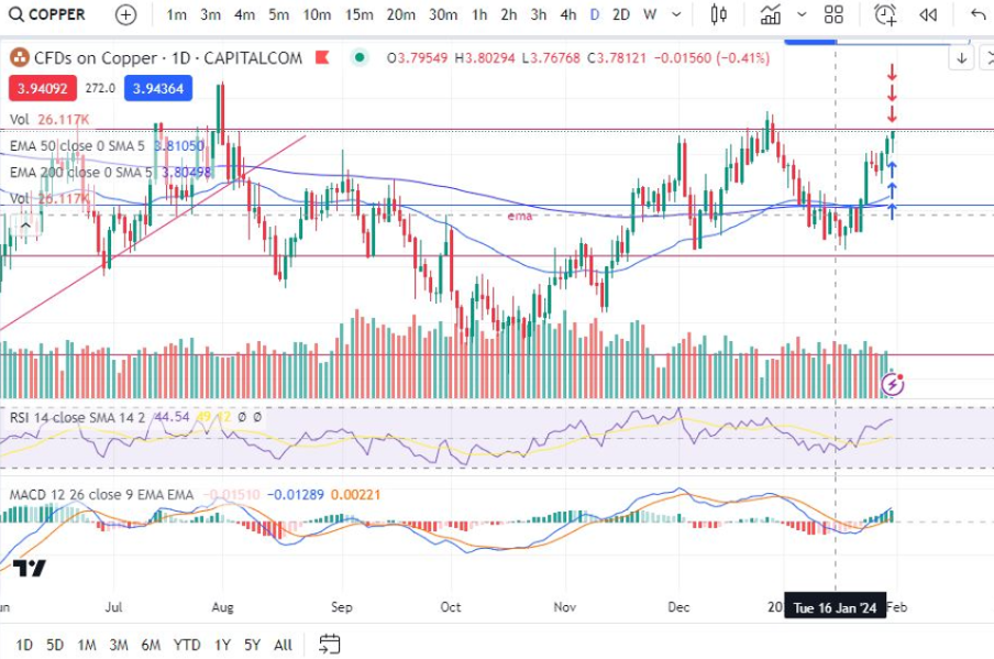
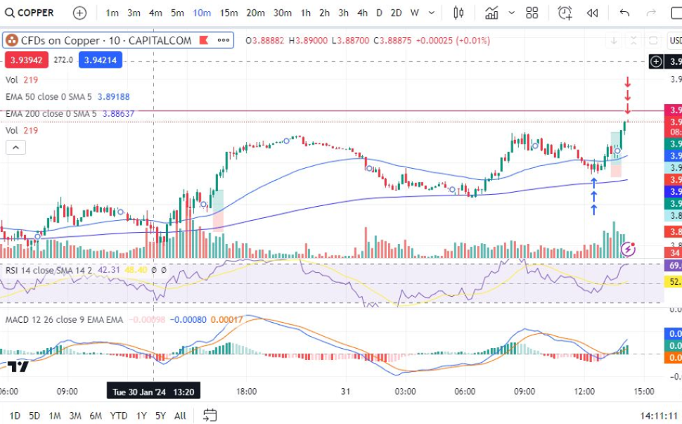
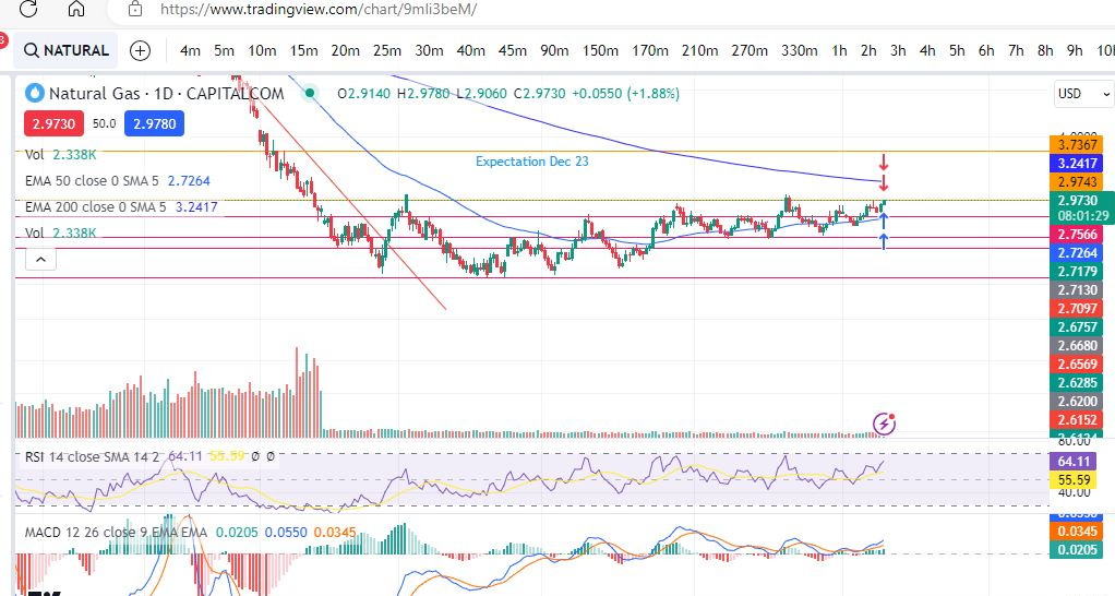
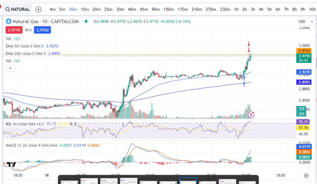
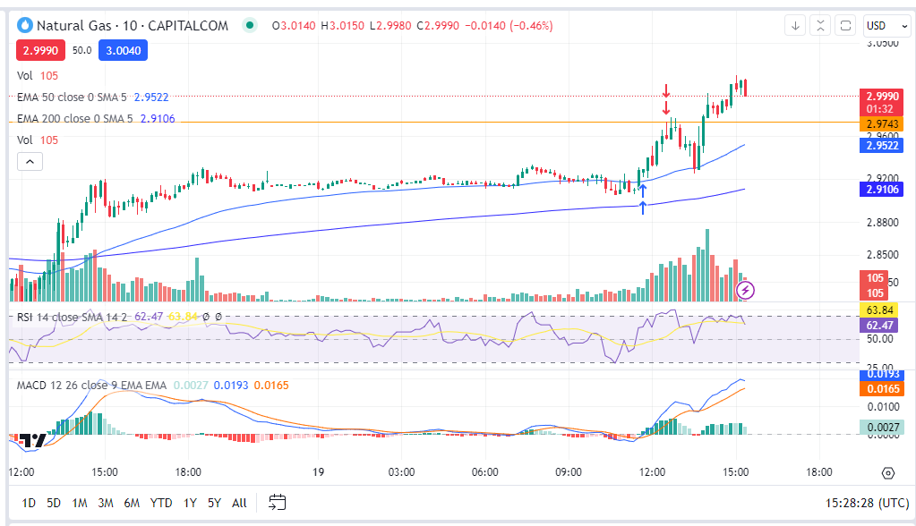
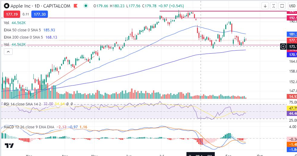
Lets take a look at some examples:

RSI indicator

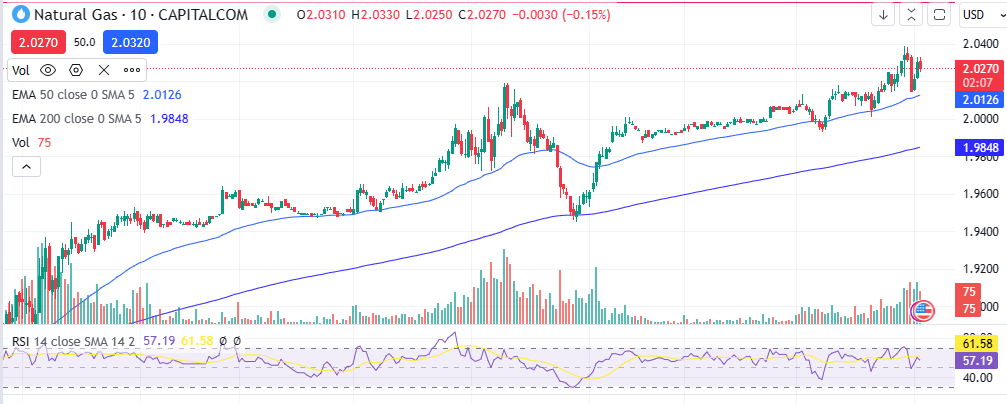
You can see in the chart for Natural Gas above, that each time the RSI falls below 30, this corresponds to a subsequent period of growth and the trend goes on to reach higher highs. Similarly when the RSI is especially high (see thepeak where the RSI extended beyond the purple area), this was followed by a sharp downwards move.

We hope you found this article helpful.

For a discount on the charting software I use, Trading View, please click on the following link:

https://www.tradingview.com/?aff_id=117138

To watch me trade the markets, please click on the following link:

https://patreon.com/Traderpro8320?utm_medium=unknown&utm_source=join_link&utm_campaign=creatorshare_creator&utm_content=co

For more great tips and advice on trading the financial markets, please see our other blog posts at:

https://trader-pro.co.uk/

Please note any subscriptions taken via my affiliate link with Trading View may result in me earning a small commission.  However, I provide complete transparency on me using Trading View personally – I publish my success on the financial markets via my broker reports and any profits earned were done so by using my own Trading View subscription,  so I genuinely do recommend them and have been using the Trading View charts for many years.

Some recent profitable trades – how to make money

Some recent profitable trades – how to make money

In this blog post I cover a couple of recent profitable trades placed. I will break down my entry and exit points. I hope you find this useful!

Seagate

Recent profitable trades

I first looked for an entry on the daily timeframe. The MACD had just made a cross over. The market was in an uptrend. The RSI was not too high. Next I checked the ten minute timeframe for an entry point:

Same thing again – looking for an entry on the MACD indicator where the MACD and signal are about to cross and ideally they are below the histogram. In this case They were low on the histogram but not quite below the zero line. The RSI had taken a dip. I set my target for the previous hight of the trend.

Recent profitable trades – Apple

Looking foran entry point, the MACDhad crossed over, was below the histogram zero level and the RSI was low. I then checked the 10m timeframe for an entry point:

The MACD had just made a cross over. Iset my target for a bit higher than the previous high. The RSI was low and the market had started to uptrend (above the 200 period EMA). Sure enough the trade reached its target!

Copper

Again, I checked that the MACD was in a good place on the daily timeframe. I also checked whether I would have enough room to reach a decent profit target before hitting the resistance level marked on the chart with the red line above.

Then I checked the ten minute timeframe for an entry point:

I set the profit target on this one for just below the red resistance level marked on the daily timeframe. I waited for a MACD cross over and the trade reached its target shortly after.

For more great tips and advice on trading the stock market, please visit:

https://trader-pro.co.uk

To watch me trade live please visit my patreon page here:

https://www.patreon.com/Traderpro8320

Finally, if you would like to receive a discount on the Trading View charting software I use, please click on the relevant link here:

https://www.tradingview.com/?aff_id=117138

Please note any subscriptions taken via my affiliate link with Trading View may result in me earning a small commission.  However, I provide complete transparency on me using Trading View personally – I publish my success on the financial markets via my broker reports and any profits earned were done so by using my own Trading View subscription,  so I genuinely do recommend them and have been using the Trading View charts for many years.

Make more money with Japanese Candlesticks – an Introduction

Japanese candlesticks can be used to create trading strategies themselves or to just help you understand the direction and activity on the chart. We examine below, the structure of a candle stick and what it means, the different types of candle sticks you might see on a stock trading chart, and how you can use the candlesticks as indicators of market sentiment.

Japanese Candlesticks and timeframes

A new candle is formed on the chart every ‘n’ minutes/hours/days/etc, depending on what chart timeframe the chart is set to. For example, in the chart below, the timeframe setting is ‘D’ for ‘one day’ – so each day another candle completes its formation. As you can see below, there are many timeframe settings. Switching between them will change the candles so that a candle appears at each interval selected.

japanese candlesticks

Structure of Japanese Candle Sticks

An example of a Japanese candlestick is shown above.

The most obvious thing to say about these is that they look like candles – but each part tells you something about what is happening to the price, as follows:

  • – Upper wick – this element shows you the highest price level which the instrument reached within the timeframe applicable to the candles.
  • – Lower wick – conversely, the lower wick shows you the lowest price reached within the time interval.
  • – Candle body – the top part of the candle will show you either the closing price, or the opening price, depending on whether the candle is red, or green (sometimes substituted for blue). Broadly, if your trade is predicting the price to rise, green or blue candles are good news, red ones are bad, and vice versa. You can see on the chart above that when the price is rising, the candles are mostly green.

The purpose of using candle sticks is to provide a quick and visual indication of what is happening to the price.

There are a few special types of candles which are easy to spot and which have extra meaning. These are discussed on our Japanese Candlestick Patterns pages linked below:

Shooting star/Hanged man:

Tweezer tops and bottoms:

We hope this helped! For more great tips and trading set ups visit our other blog pages at Trader Pro – Trading strategies for success in the financial markets (trader-pro.co.uk)

If you would like to use the charting software above, we highly recommend Trading View to you. Use the following link and you may receive a discount on your subscription: https://www.tradingview.com/?aff_id=117138&source=TraderProBlog

To watch me trade live, please visit my Patreon page here:

https://www.patreon.com/Traderpro8320

Please note any subscriptions taken via my affiliate link with Trading View may result in me earning a small commission.  However, I provide complete transparency on me using Trading View personally – I publish my success on the financial markets via my broker reports and any profits earned were done so by using my own Trading View subscription,  so I genuinely do recommend them and have been using the Trading View charts for many years.

How to use Japanese Candlestick Patterns – Shooting Star and Hammer / Hanged man to make money

Another very useful candlestick pattern which any professional trader will be aware of, is the shooting star & hammer/hanging man. These are patterns which form from a single candlestick and can indicate that a reversal or new trend is about to start. We discuss these Japanese candlestick patterns below with some chart examples.

Japanese Candlestick Patterns – Shooting Star

Note that some knowledge of Japanese candlesticks is assumed on this page. Please see Japanese Candlesticks: An Introduction here, if you are new to Japanese Candlesticks: Japanese Candlesticks – an introduction – Trader Pro (trader-pro.co.uk)

The shooting star is formed by a single candle with a long upper wick and a very short or non existent lower wick. A picture of this type of candle is below.

Candlestick pattern - Shooting Star
Candlestick pattern – Shooting Star

The pattern is formed when there has been one last push/attempt by the bears to raise prices higher, but they failed and the closing price closed below, or very close, to the opening price.

Now let’s look at some examples on the charts:

Shooting Star & Hammer/Hanging man

You can see on this NASDAQ chart that the price was in a nice uptrend, until the shooting star appeared. Prices quickly descended from that point onwards.

How can you use the Japanese Candlestick pattern – Shooting Star in technical analysis?

If you are in a long position, waiting for prices to move higher and the shooting star candlestick pattern appears on the chart, it may, when taken with other indicators, indicate a good time to take profit off the table.

Japanese Candlestick Pattern – Hammer/Hanged Man

The Hammer/Hanged Man is the opposite of the shooting star. A picture of this type of candlestick pattern is below.

Japanese Candlestick Pattern - Hammer / Hanged Man
Japanese Candlestick Pattern – Hammer/Hanged Man

As in the case of the Shooting Star, the Hammer/Hanged Man candlestick pattern is formed when the sellers tried to push the price lower, but failed, and it closed very close to where it started. It can indicate a reversal of a downtrend/beginning of an uptrend.

Now lets take a look at some examples on the charts:

Shooting Star & Hammer/Hanging man
Hammer/Hanged Man candlestick pattern

You can see in the NASDAQ chart above that the price reached a low point and then the hammer/hanged man formed. The bulls took control – the candle is green in this instance so price was pushed all the way down the lower wick but came all the way back up again and closed higher than the candle’s opening spot. Following this, the price reversed in a strong uptrend pattern.

How can you use the Hammer/Hanged man in technical analysis?

If you are looking for an entry point or are waiting for a reversal, this candlestick pattern, when taken with other indicators, could give you a good entry point.

We hope this was useful. You are likely to see a great deal of these candlestick patterns on the charts – we hope you are able to make good use of them in becoming more profitable.

We hope this helped! For more great tips and trading set ups visit our other blog pages at Trader Pro – Trading strategies for success in the financial markets (trader-pro.co.uk)

If you would like to use the charting software above, we highly recommend Trading View to you. Use the following link and you may receive a discount on your subscription: https://www.tradingview.com/?aff_id=117138&source=TraderProBlog


Please note any subscriptions taken via my
affiliate link with Trading View may result in me earning a small commission.  However, I provide complete transparency on me using Trading View personally – I publish my success on the financial markets via my broker reports and any profits earned were done so by using my own Trading View subscription,  so I genuinely do recommend them and have been using the Trading View charts for many years.


How to make money trading! Trade set ups 19/09/2023

Hi guys

I wanted to share three different trade set ups with you – one which was a nice profit, another where the set up failed to progress in line with my intended entry plan and another where I am currently waiting to see if I should jump in… here goes!

Trade set ups – The profit maker: Natural Gas 19/09/2023

Here’s the daily chart screen shot – anyone familiar with my trading style will be aware that the daily time frame is the bible to me. You can see below that the market is slowly trending up… It was about to reach a ceiling in that it would soon touch / bump into the resistance lines on the daily timeframe – and potentially come back down. I made sure there was enough room to get a small trade in before it reached the orange line at around 2.9730:

Here it is again, this time on the ten minute timeframe:

You can see the markers with this timeframe of where I jumped in and out of the trade. My stop area would be below the moving average/lowest price most recently to the entry point.

The orange horizontal line is where I had marked exactly where the daily timeframe ceiling exists – so that I can see it on the smaller timeframes. By ceiling I am referring to the orange resistance line, mentioned above. Indeed you can see from how the trade played out, that the price did start to see resistance at that level.

Here’s a subsequent snapshot – you can see, as I predicted, the price fell back down from the orange line before going on to make new highs. This made a nice little profit. I’ve been trading the 10 minute timeframes most recently which i’ve started to enjoy. Some traders check the timeframes above the smaller ones like 1 hour, 4 hours etc but mostly I find I can make profit by just using the daily timeframe as my higher reference point.

Trade set ups – Silver 19/09/2023

I’m sharing the daily and ten minute timeframes below again. On this one, I was waiting for the price to come down to the red horizontal line (at around 23.226), a major support area marked on the daily timeframe. Unfortunately, the price sailed straight down through this line so I abandoned my plan to jump in:

The trade set up which I was waiting on… ZZZZZZZZZZ ZZZZZ – Apple trade set up 19/09/2023

Here’s a trade set up I was waiting on:

The price looked like it was bouncing at a recent major support level on the daily timeframe – if the MACD cross over happened on the 10 minute timeframe, I wanted to jump in…

Trade set ups – Apple – how it played out!

OK… so this one was really interesting for a beginner trying to learn. I actually got in and out of this twice based on what was happening on the chart… let me explain!

In the above chart screen shot you can see I entered the trade. My intention was to get out at the previous high on the ten minute timeframe. Everything was looking ok at this point. Then this happened:

It started to make a little bump over on the four minute timeframe. The MACD had crossed to the downside. It could have just been a healthy pull back. However, with the miniscule and red candles being formed since entry, I felt nervous enough to jump out again!

After this the price started to recover and show signs of a strong push up/it was bouncing/finding support at the EMA line:

I jumped back in. You can see the two different entry points and my first exit above. NB: there are two arrows on each entry/exit because I run two different parallel versions of my trading concurrently – this is not important… I just don’t want beginners to become confused.

Finally, the price reached my original target at around the previous high on the ten minute timeframe… BOOM!

Trade set ups

A couple of takeaway points can be made from this trade set up and the way it played out:

  1. You should not be afraid to jump out of a trade if you feel uncomfortable with how it is unfolding – you can always get back in!
  2. Sometimes the markets do not behave immediately the way you would like them to – patience is key.

We hope this helped! For more great tips and trading set ups visit our other blog pages at Trader Pro – Trading strategies for success in the financial markets (trader-pro.co.uk)

If you would like to use the charting software above, we highly recommend Trading View to you. Use the following link and you may receive a discount on your subscription: https://www.tradingview.com/?aff_id=117138&source=TraderProBlog

Please note any subscriptions taken via my affiliate link with Trading View may result in me earning a small commission.  However, I provide complete transparency on me using Trading View personally – I publish my success on the financial markets via my broker reports and any profits earned were done so by using my own Trading View subscription,  so I genuinely do recommend them and have been using the Trading View charts for many years.