The MACD – Moving Average Convergence Divergence (hereafter referred to as ‘MACD’) is an extremely useful and very popular, indicator. It can help you to identify good entry and exit points and whether the market is over or undervalued as well as much more. There is a lot to this indicator. We discuss some of its more broad uses below.
MACD – The Moving Average Convergence Divergence – what exactly is it?
The MACD is a lagging indicator which is used for momentum and trend following trading strategies. It broadly displays two lines – the Signal line and the MACD line, which interact with each other by crossing over each other, intermittently. The indicator also displays a histogram which can be used to determine the strength of a given move in one direction or another, as well as an early indication of whether or not a buy or sell signal (MACD/Signal lines crossing (more below)), is about to happen. These components and uses are discussed in detail below.
MACD – The Moving Average Convergence Divergence – The ‘MACD’ line
The MACD line shows the interaction between two exponential moving averages. The settings for these averages can be tailored on the chart software. It is displayed by the software as the difference between the two moving averages, as set by the user. The default settings are a ’26 period EMA’ and a ’12 period EMA’ (EMA = “Exponential Moving Average”), and the default colour is blue (using Trading View software).
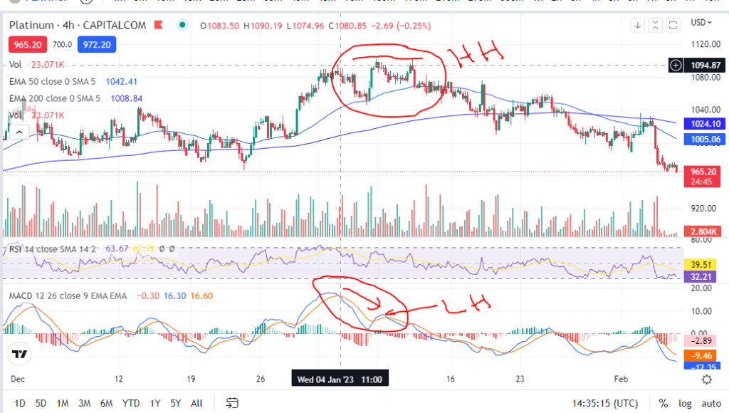
The MACD line can be used to identify whether a move is nearly at its end. For example, if the candles on the chart have reached a new high, but the MACD line did not, it can indicate that the move is running out of steam and a reversal may happen soon . This is referred to as ‘divergence’ – a divergence between the candles/price and the MACD line movements. Caution should be taken when attempting to use the indicator for entry points in this scenario. See the picture below. The candles reached a higher high (HH), but the MACD reached a lower high (LH). Following this, the price steeply declined . This was at the end of a long upward trend and it is within a trend that it is likely this cross over indicator would be used. Care should therefore be taken before entry, to check that there is no divergence in this way between price and the MACD line.

MACD – The Moving Average Convergence Divergence – The ‘Signal’ line
The signal line is a nine day EMA of the MACD line. The default colour of this line is orange.
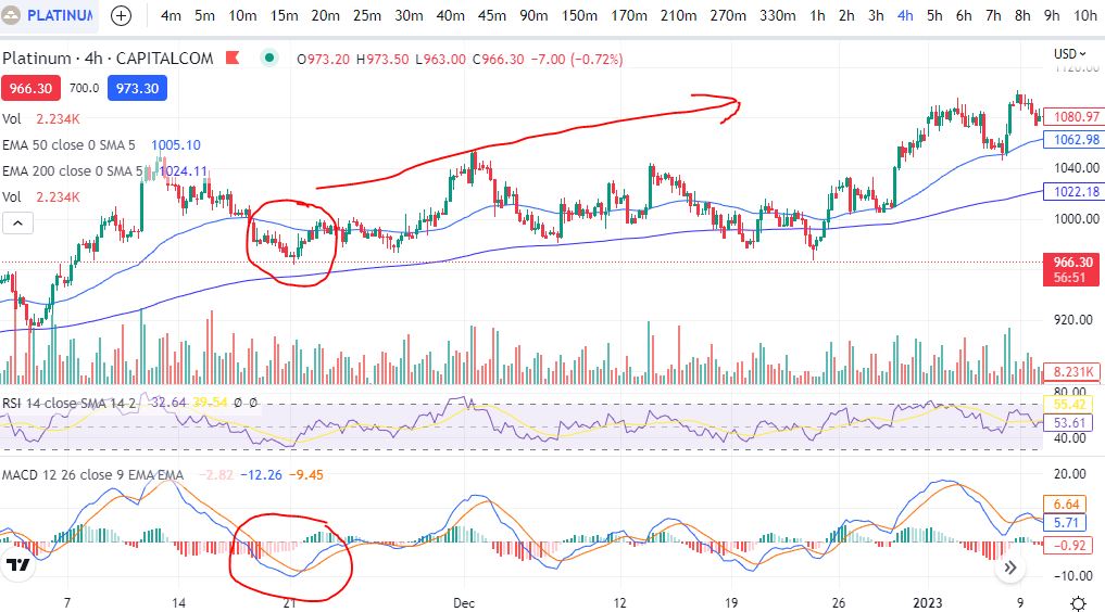
When the signal line crosses the MACD line, it can indicate that the price is going to move higher or lower from an oversold or overbought level. See the example below. The signal line crossed the MACD line at a dip in the price and following this, the price trended higher. This is used by many traders, when taken with other confirmations, as a good entry signal. The writer uses this indicator the most, in trading set ups. The use of the indicator in this way is meant to identify good entry points on trends. Therefore, it should not be used as an entry signal when the price is consolidating between two very obvious levels.

The ”Histogram’
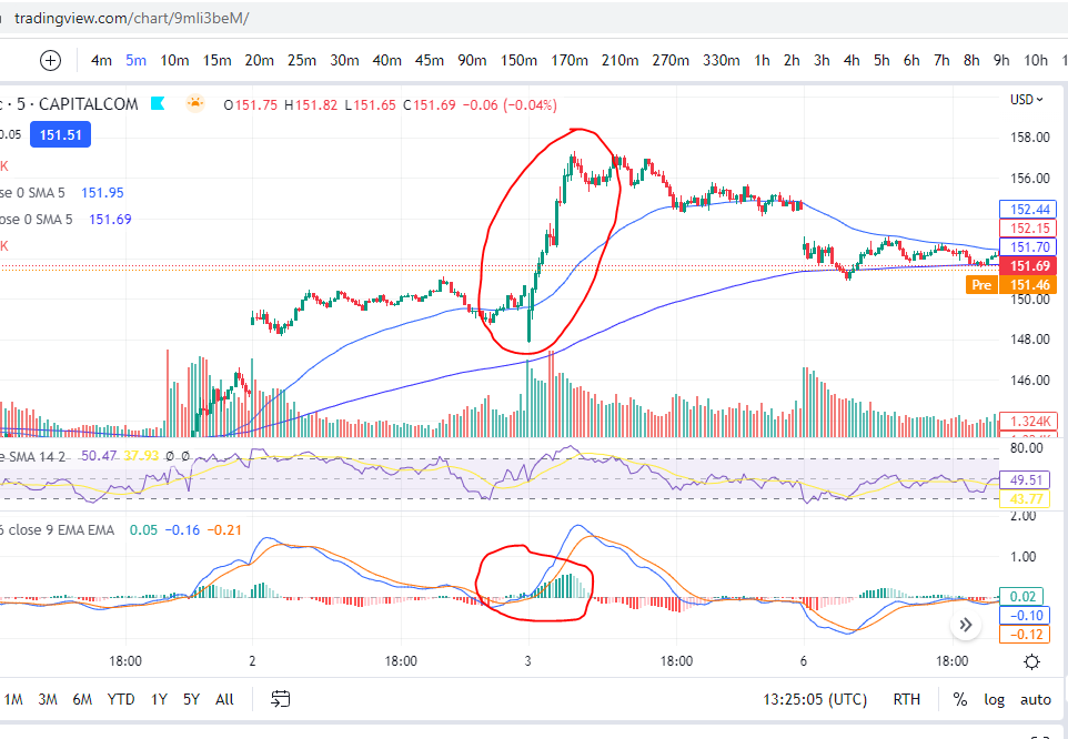
When the data in the histogram is above the baseline (positive), it means that the MACD is higher than it’s nine day average, meaning that the price has recently seen an increase or upwards momentum. The opposite is true for the opposite scenario – if the data is below the zero line on the histogram, it indicates that there has been some recent downward momentum. This can be seen on the chart below, where there was a strong upwards push and the histogram went from negative (red) to positive (green).

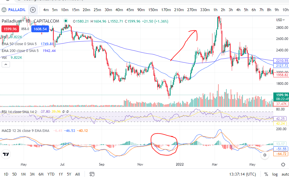
The histogram can be used to determine if a cross over is anticipated when it forms divergences. These divergences can be seen with reference to the peaks and troughs in the histogram and the MACD line. For example, if the MACD line creates a lower low, and the Histogram data displays a higher low. This is displayed, by way of example, on the chart below. You can see that the histogram made a higher low (see movements in red circle), but the blue MACD line, had reached a lower low. Following this, the MACD and Signal line crossed over and the price moved significantly higher. You can watch for the opposite scenario if you are waiting to short the market – a higher high on the MACD line, but a lower high on the histogram. This can indicate the MACD and signal lines are about to cross for a downward move. The histogram pattern can be in the form of peaks and troughs for the higher lows etc, or a slanted pattern where there is no dip in the histogram – it is just more smooth looking!

Identifying overbought and oversold levels
As you can see in the chart picture above, the MACD indicator tends to broadly follow the shape of the RSI indicator (‘Relative Strength Index’). If you are not familiar with the RSI indicator, broadly, the price is overbought when it reaches the top part of the indicator (roughly anything over the value of ’70’ would be overbought). The opposite is true when it reaches the bottom part (say, below 30). Unlike the RSI indicator, the MACD is not adjusted for each market so that it displays ‘comparative information’. What is meant by this, is that on Palladium above, the value at overbought levels, on the RSI indicator, will always be roughly ‘over 70’. The same will be true for any other market displayed on the chart when using the RSI. However, the MACD indicator does not provide equivalent values/it does not keep the ‘overbought’ value the same between different markets. Instead, you can use the ‘shape’ of the MACD and signal lines to understand when the price is either overbought or oversold for the market you are viewing in particular, with reference to the highest peaks and troughs of the MACD and signal lines.
For more secrets on using the MACD indicator, please see our other blog articles here:
and here:
https://trader-pro.co.uk/category/technical-indicators/macd-technical-indicators
We hope this information on how you can use the MACD indicator in your trading strategies and setups, has been useful. Keep an eye out for our blogs which we will use to display trade set ups including the use of this indicator.
We hope this helped! For more great tips and trading set ups visit our other blog pages at Trader Pro – Trading strategies for success in the financial markets (trader-pro.co.uk)
If you would like to use the charting software above, we highly recommend Trading View to you. Use the following link and you may receive a discount on your subscription: https://www.tradingview.com/?aff_id=117138&source=TraderProBlog
Please note any subscriptions taken via my affiliate link with Trading View may result in me earning a small commission. However, I provide complete transparency on me using Trading View personally – I publish my success on the financial markets via my broker reports and any profits earned were done so by using my own Trading View subscription, so I genuinely do recommend them and have been using the Trading View charts for many years.